In this guide, we’ll go through some in-depth techniques that will improve your conversion rates by reducing abandoned baskets.
Is there anything more frustrating than an abandoned basket for an e-commerce retailer? It takes a lot of work to even get a customer / potential customer to this point, so to see the shopping cart abandoned at the final hurdle is heart-breaking, not to mention bad business.
So your thorough SEO strategy or excellent PPC campaign has brought valuable traffic through the door, and your optimised landing page did a great job of closing the sale to the point of adding a product to the basket – but then what happened?
If baskets are being abounded, you need to find out why…and now! Let’s work out how to close the loop on these abandoned baskets.
It’s not just about a single conversion
Before you ask the question “why are my visitors not converting” you first need to identify where the major drop-outs in your checkout flow are happening.
Understanding this allows you to better focus your efforts to parts of your website which can have the biggest impact on sales.
Identifying where potential customers are dropping out from your checkout flow
Ideally, you want to ensure your checkout flow is as simple and short as possible.
The goal here is to make going from your product landing page, to the “thanks for your order” page, in as few steps as possible – thus reducing the likelihood of customers getting lost along the way.
Identify high bounce rates in Google Analytics
Our first port of call is to check bounce rates for your landing page.
If you’re not familiar with the term bounce rate, it’s simple: Bounce Rate is the percentage of single-page sessions (without engagement/interaction) visitors have had on your site without.
In other words, sessions in which somebody left your site from the same page they entered on, without interacting with the page (clicking links / adding product to basket).
[Tweet “Learn to identify high bounce rates in Google Analytics. “]For example, a potential customer searches Google for “Playstation games” and clicks through to the “Playstation games” landing page of your site. They then leave your site from the same page, without visiting any other pages on your site.
So as you’ve probably worked out, a high bounce rate is a bad thing. A high bounce rate usually means something on that page is turning visitors off and making them leave your site quickly.
So let’s identify those pages…
To start, simply load up Google Analytics (we’ll assume you have analytics setup, but if not, check out our guide).
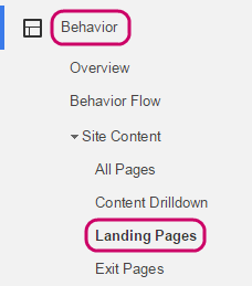
From the menu on the left, look for “Behaviour” and then “Landing Pages”.
From here you can view data on your landing pages, including bounce rate.
To quickly see the worst offending pages, just click the “Bounce Rate” column to arrange from highest to lowest (remember to filter out any irrelevant pages).
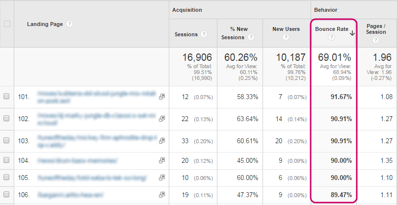
From here you can easily see at a glance what pages are being negatively affected by a poor bounce rate figure.
Know what visitors are clicking: Use in-page analytics
When creating a landing page leading to a conversion, you may find yourself linking to other pages on your site, or other websites all together in an effort to provide your visitor with as much information as possible.
However, you can only really work out what links/information visitors actually want by testing.
[Tweet “Know where your visitors are clicking with in-page analytics. “]Using the “Page Analytics” extension for Google Chrome, you can easily see what links are being clicked on your landing page.
Load up the extension, and visit your landing page (you can also access In-Page analytics from your Google Analytics dashboard, but we prefer this method – it’s quicker!).
You’ll quickly see the orange click percentage hovering over links on the page.
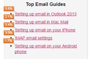
Using this data you can easily make an informed decision on whether a link should be present on the page at all, or if it should be moved to a more prominent position.
For example, our “Setting up IMAP email on your iPhone” guide seems more popular than the “Mac Mail” guide, so it’s a good idea to give the iPhone guide more prominence and move it up the list.
This can only help conversions as you are making sure you’re only adding links to the page that visitors are finding useful.
Heatmaps: Where are visitors clicking?
Heatmaps are an invaluable tool that will give you exact visualisation of visitor behaviour on your web pages.
This information can be used to solve problems such as…
- Are visitors trying to click on elements of the page that don’t actually link?
- Are lesser important elements of your page distracting visitors from your core goal?
- Are important elements of your page below the fold? Is this hurting click-through rates?
There are plenty of tools available online to create heatmaps for your web pages such as Crazyegg, ClickTail, and Mouse Flow, but at LCN.com we use Hotjar.
Whatever you choose to use, once you’re set up and some traffic has passed through your site, your heatmap will give you some very interesting insight into your visitor’s behaviour.
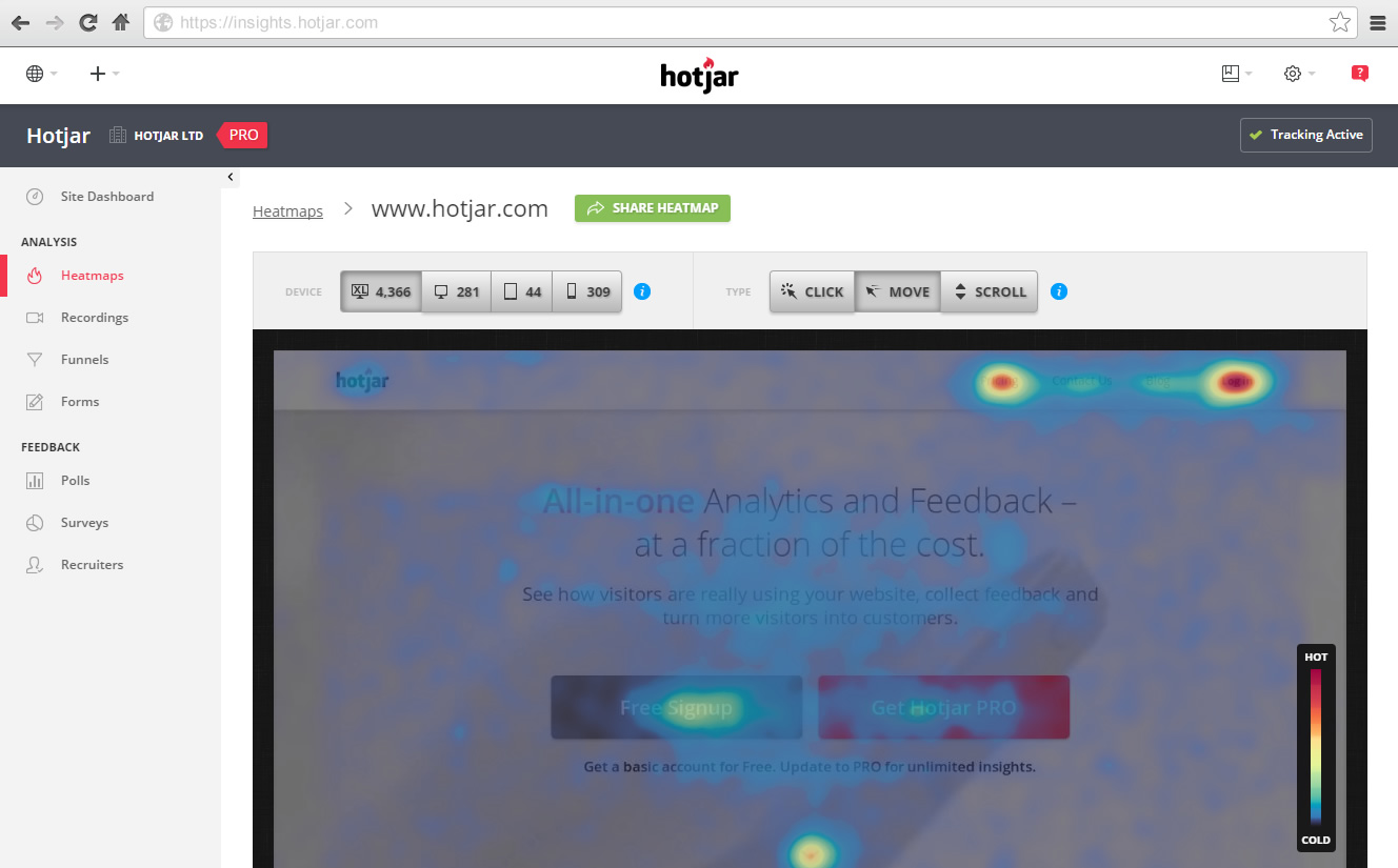
To help close the loop on abandoned baskets, we want to pay special attention to where people are clicking on your page.
If your heatmap is highlighting that your primary CTA button (e.g. add to basket, sign-up, checkout) is not receiving enough clicks, try testing a different design and putting the button in a more prominent location on the page.
Don’t stop there!
Experiment with different calls to action for your button, different colours and sizes – all these subtle changes can add up to make a big difference in your click-through rates.
[Tweet “Heatmaps are an invaluable tool to understand how customers engage with your site. “]Conversely, you may notice your visitors are trying to click certain elements that may not be links or buttons/links you may not deem that important in turning these visitors into customers.
These elements are likely to be confusing your customers and making the checkout process more difficult than it needs to be.
Heatmaps are invaluable because without them you cannot truly understand how your customers are interacting with your page and moving through your check-out flow.
![]()
Understanding why visitors are not converting
Now we have investigated how potential customers might be dropping out of your checkout flow let’s focus on understanding why they aren’t converting.
Your landing page and checkout flow might well be airtight with little or no confusing elements along the way, but you may still have a low conversion rate to contend with.
So why aren’t visitors converting into sales? Ask yourself these questions:
Is your landing page relevant to the visitor’s entry path? For example, if a visitor to your site came in via a Google search for “Computer keyboards” then your landing page better be about computer keyboards!
Or if your visitor arrived via paid means, such as Google Adwords, is there continuity between the message within the advert and your landing page?
Relevance is key! Don’t use irrelevant hooks to lure customers to your page because they’ll just bounce.
Does your page contain all the relevant information? When creating a product landing page it’s a heinous crime to omit important information.
This is simple; just ask yourself what information your customers will want before committing to a purchase – if you can’t work this out easily, just ask your existing customers.
Is it obvious to customers what they are supposed to do next? So, your visitor has read your landing page… now what?
Every landing page has a goal, whether it’s to download a file, collect an email address for a mailing list, or sell a product.
Make it blatantly obvious what course of action your customer is supposed to take on this page.
[Tweet “If you’re suffering from a high bounce rate, ask yourself these fundamental questions. “]You and your team can go through your landing pages with a fine-tooth comb and not find a problem, but you can guarantee your customers will be able to give you invaluable feedback as to how to improve your landing page and checkout flow.
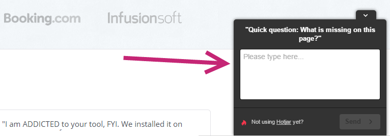
In-page polls and feedback prompts
In-page polls and prompts for customer feedback on various important landing pages will result in some great ideas and comments, many of which you may have never considered.
Again there are many solutions out there to get customer feedback, but we recommend prompting for feedback in a real-time situation – as your customer is on your landing page.
At this stage, your customer will be able to give you the most useful comments, as well as increasing the likelihood they will convert with your assistance
Hotjar does the job nicely with a non-invasive popup.
Usertesting.com: Have real people test your site
If it’s in your budget, usertesting.com is another fantastic way to get real user feedback.
Using their pool of over a million testers you can have a particular demographic perform tasks on your website.
As they navigate their movements on your site are recorded whilst the user narrates their thoughts out loud.
While this feedback can sometimes be a little hard to hear since users can be brutal, it’s the feedback you need to hear in order to improve.
As well as having your own website scrutinised, it’s well worth having few competitor websites tested so you can see what works for them.
All’s fair in business – the competition may be using some cool tricks that you aren’t.
Live chat
You’ve no doubt come across live chat before if you shop online, with it being used to great effect by companies like Virgin Media and EE – and of course us at LCN.com, our customers find it incredibly useful.
Live chat is a simple pop up module that will appear on a landing page (usually bottom right), often after a visitor spends a defined amount of seconds on the page without engaging – you can assume at this point the visitor may have a question to ask.
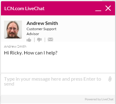 LiveChat at LCN.com
If installed on a sales page, you can assume that your visitor is in the frame of mind to make a purchase, so you can take advantage of this by quickly answering any queries and allaying any fears they might have before they take the plunge.
And best of all, your visitor doesn’t have to leave the sales page to find out all the information they need.
There is a big range of live chat applications to choose from online, some of the more popular ones include LiveZilla, Zopim Livechat (which we used at LCN.com), and LivePerson. Once you have settled on a specific live chat tool, you can get to work on closing that abandoned basket loop.
[Tweet “Livechat allows you to gain customer feedback in real-time, while boosting conversions. “]Whilst aiding a single conversion is great, it’s not where the core value is.
Ensuring your business is capturing qualitative feedback from these customers and implementing changes to your website allows you to address any potential confusion future visitors might also experience.
This should be an always-on process to capture information to feed into future design iterations and A/B tests.
Abandoned basket emails
What if despite your best efforts, your visitor still abandoned the basket, for whatever reason? You still have an opportunity to reach out to them.
If you shop online regularly you would have no doubt come across abounded basket emails already.
It works like this; your visitor abandons the basket at some point in your checkout flow, and hours or days later receive an email from your company reminding them they can still buy the product.
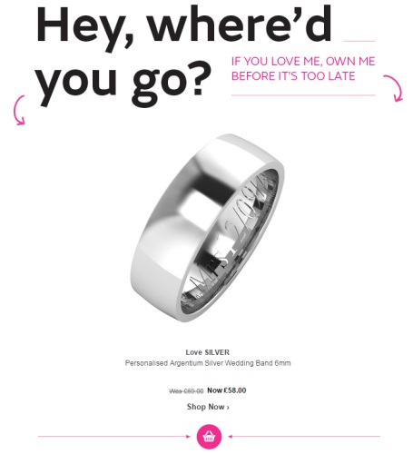 Fashion retailer “Very” take a very simple and light-hearted approach to their abandoned basket emails
You can take the approach of asking the customer if they needed any assistance in order to complete the transaction. Did they get confused with your checkout flow, did they not find the information they want? Make sure there is a way of collecting this data.
You can also use these emails as a second chance to convert. Include a simple CTA button to allow your potential customer to add this product easily back into the basket.
[Tweet “Customer abandoned basket? Get a second bite of the cherry. “]To make this proposition more appealing you can include a discount or some other incentive to help make that final push to buy.
Or how about combing the two strategies? Offer a bigger discount to visitors who give useful feedback.
The only drawback to abandoned basket emails is that you need to have the visitor’s email address (obviously!), so in most cases, you’ll only be able to target existing customers who are logged into their account when browsing your website.
Improving on-site conversions
Now you have identified why visitors might not be converting into sales on your landing pages, you can make the relevant changes to fix them.
A good conversion rate is worth its weight in gold. You could have a million visitors daily, but with a 0% conversion rate, you aren’t turning those figures into revenue.
Conversion rate optimisation is a mixture of common sense practices (such as increasing the speed your web pages load) and lots and lots of testing!
Let’s start with some of the fundamental things you need to consider when optimising for conversions.
Speed up your site
One of the most common causes of abandoned baskets and poor conversion rates is terrible load times. Nobody waits around for a page to load for ages, especially when trying to purchase an item. This means you’re going to have a high bounce rate.
As well as being annoying for your visitor, it can also leave them worrying about how trustworthy your site is.
[Tweet “A slow site can be a common cause of abandoned baskets. Speed up your site… “]What sort of company are they dealing with if they can’t even get their website working properly? And as anyone who has ever shopped online will tell you, there’s nothing worse than a page hanging after you have submitted your payment details.
To speed up your site your first port of call is Google’s PageSpeed Insights.
Simply pop your URL into the tool and the application will fetch the URL as a desktop client and as a mobile client and will provide you with a score out of 100. According to Google, a good score is 85 or above.
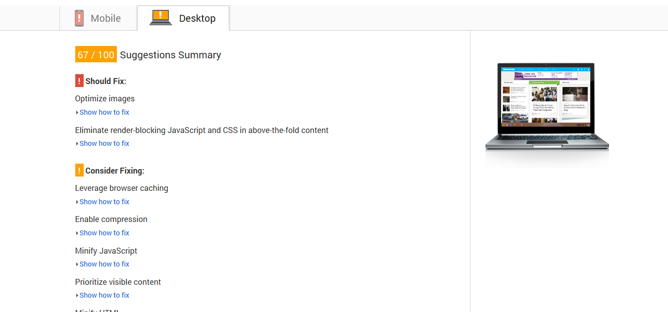 Google PageSpeed
You will also receive a swift report that will recommend what fixes you can put into action to improve the speed of your site.
Each fix is given either a red, yellow or green explanation point telling you the priority of the work you need to carry out.
Another great, more advanced, tool to consider is GTmetrix. GTmetrix analyses your pages and descriptive advice to help you understand what each element of the report means.
It also handily imports PageSpeed and YSlow scores and recommendations.
Common recommendations include browser caching, reducing image size / resolution, minimising the number of plugins / widgets you may be using.
Check out our guide on PageSpeed Insights for more details.
Finally, it could just be that your hosting platform is slowing you down. Many ecommerce platforms require a more dedicated solution with more power than regular shared hosting.
At LCN our cloud hosting platform is perfect for this. Take a look at the different configuration options to get an idea of the kind of flexibility / scalability you can achieve – this makes it a lot easier to provide your ecommerce solution the power it needs in order to perform at a level that won’t cause abandoned baskets. Contact us for more information.
Clear call to actions
As touched on earlier, call-to-actions (CTAs) are vital to consider as they inform your visitor what action they are supposed to be carrying out on a page.
Without them, or with poor CTAs, customer may well get lost and you’ll never achieve your page goals.
[Tweet “Don’t underestimate the impact call-to-actions can have on your conversion rates. “]One of the most commonly used types of call-to-actions are CTA buttons. They act as clear visual cues for visitors to click through to relevant pages / add products to their basket.
Position your CTAs buttons so that they are easy to see, and use copy that is concise and to the point. Something as simple as “Buy Now” now can work well.
Let’s break that CTA down…
- Buy: This is the course of action you wish the user to take
- Now: This adds a sense of urgency to the message.
- Positioning of CTA: Where the CTA is on the page. For instance, the CTA must be positioned appropriately to the relevant product so the customer clearly knows that they are adding the right product to their basket.
Size, colour, positioning and copy of the button can all affect conversion rates. Take a look at a more in-depth write up on CTA buttons here.
Boosting Ecommerce conversions
There are plenty of smaller (more specific) changes you can make to improve conversions for online shops.
No two shops online are alike but many have great elements that you may want to consider using for your own store.
Be sure to research both the competition, and big established retailers such as Amazon, eBay and Tesco.
Try-out these suggestions…
- Allow product reviews. Give your customers faith that others are buying and enjoying your products and services.
- Create a sense of urgency. Include stock levels when stock is running low, or time sensitive shipping such as “next day delivery if ordered by 3pm”
- Free shipping: Where possible include free shipping. Be aware that shipping costs may need to be factored into the item price itself.
- Responsive design: Make sure your site works perfectly on all devices
- Multiple payment methods: Try not to limit how you customers can pay you. Include all credit and debit cards and PayPal. Selling tech gear? Why not try allowing payment by bitcoin
- Returns policy / money back guarantee. Make it obvious from the beginning the purchase is risk-free to your customer. If the service isn’t right for them, give them a 30 day money back guarantee. Product not right? Make sure your returns policy is simple
- Use SSL. This should be a no –brainer for every online store. Encrypt web sessions with SSL and keep your customer data save. Did I mention we also sell SSL certs at fantastic prices 😉
For more take a look at our 8 tips to boosting ecommerce conversion rates post.
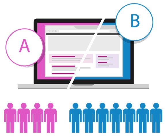
A/B split-testing
Once you’ve done everything you can to make sure your landing pages are as enticing and easy to use as possible, the next job is testing! Only by testing different designs and copy will you truly understand what works for your visitors.
A/B testing is the running of two or more separate campaigns where variables are adjusted differently to optimise results.
[Tweet “A/B split testing is key to finding holes in your sales funnel. “]In the simplest instance of A/B testing you’ll have a control campaign (i.e. your original landing page), and then the new test sample – an alternative optimised landing page with the same core goal.
Direct a portion of your traffic to the new page and monitor the results. Before long, with an idea of how the test is going, you can experiment with changes on your test page to see what variables harbour the best results.
Find out more, check out our beginners guide to A/B split testing.
Here are some examples of core variables you might consider changing when running an A/B test…
- Copy changes
- Imagery changes
- Different CTAs
- Change the colour of certain elements (including CTA buttons)
- Moving page elements around (such key information above the fold)
Get started split testing with these 5 landing page split tests.

Couldn’t complete a conversion? You have a second chance
Nobody has a 100% conversion rate – if they do, I want in! You’ll always have further opportunities to convert visitors who didn’t complete a transaction the first time around.
As we’ve investigated, visitors bounce for all sorts technical reasons such as irrelevant copy, poor UX / design, slow load times, etc., but sometimes there is no logical reason – they just didn’t want to buy at that time, and that’s fine!
Thankfully you still might be able to strike whilst the iron is, well, warm.
Remarketing
You’re probably familiar with remarketing even if you haven’t heard the term before. Ever feel like an advert is following you around the web, regardless of what site you are on? This is remarketing in action.
Remarketing works by using cookies. Cookies are small files containing various data left on your computer (usually your browser cache) when you visit a website.
Using the data in these cookies, advertisers using the Google Display Network, Facebook Ads, Twitter Ads, and a number of other ad platforms can target you with highly relevant adverts based on your past browsing history.
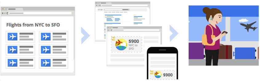 Visitor lands on your web page and leaves > is retargeted across the web > revisits to complete purchase
This is a highly effective way to advertise, since you are displaying adverts to individual who have already shown interest in specific products.
So instead of advertising your website or general services, you can display the exact item a potential customer may have been viewing days or weeks before.
Take a look at our beginners guide to remarketing to get started.
Custom audience targeting
Custom audience targeting is available on both Facebook and Twitter (called “Tailored Audiences”). It’s similar to remarketing as in it allows you to retarget people familiar with your brand.
However, for custom audience targeting you’ll need an email address or phone number of the customer you want to target.
[Tweet “Facebook Custom Audiences is a great way to retarget existing customers who didn’t convert”]Every online business should have a mailing list. It’s a ridiculously simple and affordable way to communicate with your customers (and non-customers if they subscribe) about new products, special offers and general news about your business.
If you’re not collecting email addresses for the purposes of email marketing, start NOW!
To get a custom audience ad campaign started at either Facebook or Twitter, you just create an ad campaign on those platforms as usual, but then upload a list of email addresses from your mailing list.
Any of your customers on that mailing list, who also use Facebook or Twitter, will then see your adverts displayed across those networks.
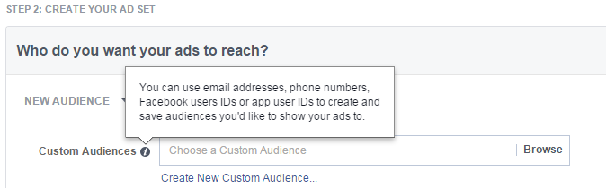 Facebook Custom Audience feature
The possibilities for this are almost endless. If you’re taking customer email addresses we’ll assume you have other data available on those customers too (Facebook also has their own data available), so you can now start segmenting your lists.
A simple example of segmentation would be to divide your lists into men and women – something that would be very useful for a fashion retailer. This stops you wasting money targeting adverts for bras at men!
You can then go further; segment by gender and age and create an ad campaign to target over 40s male with relevant products.
Or visit your customers recent purchase history – if you know particular customers like a certain brand of jeans, you can more effectively target them with ads.
Custom audience target allows you target specific demographics with specific products and services you know appeal to them.
This increases ad conversion rates, and in turn makes you ad campaigns more cost effective.
Take a look at these Facebook and Twitter guides a walkthrough to getting you custom audience campaigns up and running.
Learning from, and making it easier for those who did convert:
You should never assume that just because a customer converted that they will do so in future.
Maybe your checkout flow had a number of issues, but a special offer the customer was presented with was enough for them to struggle through a difficult process just to take advantage of a discounted price.
Post checkout messages/emails are a great way to show your customers that you want to serve them better.
Capturing this feedback offers huge value as it can help encourage repeat purchases and develop your customers into brand advocates.
Don’t forget to follow up with customers to thank them and let them know you’ve made the improvements on the back of their comments as it will help encourage them to give more feedback in the future.
Conclusion
Hopefully the above tips and tricks will be enough to see your conversion rates increase and dramatically stop the volume of customers getting lost along the way to the checkout.
Abandoned baskets are a pain but there is a silver lining – people are finding your site and are interested in your products, now all you need to deal is seal the deal.
To recap some of the most important points of this, fairly epic, post…
- Identify where you are losing potential customers: Identify bounce rates, understand your visitors behaviour.
- Find out why visitors aren’t converting: Get feedback from you customers wherever and whenever you can, and act accordingly.
- Improve conversions: Speed up your site, make your CTAs irresistible and run A/B tests… again and again and again!
Your say!
There’s a lot to investigate and put into action when closing the loop on abandoned baskets, so I’ve probably missed some great tips and techniques.
With that in mind we’d love to hear your thoughts on how to mitigate abandoned baskets. Leave us a comment below.
26 thoughts on “Conversion Rate Optimisation: Reducing abandoned baskets”
Comments are closed.