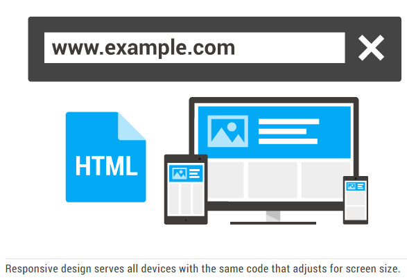
Today’s companies are focusing more on responsive website design, the kind of designs that self-adjust across multiple screen sizes, on any device.
However, there is something far more important than just making sure your website is mobile-optimised.
Whilst being mobile-friendly is extremely important, the real importance lies in making sure your design is customer-centric and responsive to how your customers interact with your website.
[Tweet “Be customer-centric and use truly responsive design…”]Having a responsive design isn’t just about making sure your fonts are compatible with mobile devices.
It’s not just about making sure users can easily interpret your site on their mobile phone without having to pinch or zoom.
It’s ultimately about making sure you avoid the most common mistake companies make when deciding to change an existing design or launch a new one.
A Common Mistake: Set it and Forget it
One of the bigger mistakes as business can make is to hand over the responsibilities for website design to one employee, an external designer, or a digital advertising agency, without ever adjusting that design or reviewing its performance.
It’s common for a website designer to have a certain preference or liking to what he or she designs.
With that invariably comes ownership of the design, an inability to change, an unwillingness to accept different viewpoints or preferences, and stubbornness towards accepting that perhaps the design can be improved or tweaked.
After all, who else is best positioned to design the website than the website designer?
 Google recommend responsive design
However, this misses the most important aspect of having a truly responsive design; your website should respond and adjust based on what your customers do, when they do it and how they do it when on your site.
In this case, it’s far more important that your design is customer-centric and responsive to how your customers interact with your website, especially as your website is your online sales funnel and its primary goal is to inform, service and sell customers.
Whilst you can’t ask every single customer how they feel about your design, there are ways to make sure that your design is optimised for your market and customers.
To help, here are three simple strategies that can ensure your design is truly responsive.
Heat Map Software
It makes sense that a user’s cursor naturally follows their eyes, or put differently, follows what they are looking at. Heat map software tracks cursor movements across your entire website and shows high-traffic areas and points of interest on a heat map.
The map provides a big picture view of cursor movement, what sections of the website that users are drawn to, the amount of page they scroll before clicking on a link, and how long they stay in a given area before moving on to another page.
This functionality allows you to identify what portions of your website are working and what aren’t.
All of this information can be gathered in real-time, allowing you to see exactly what your customers are doing as they do it.
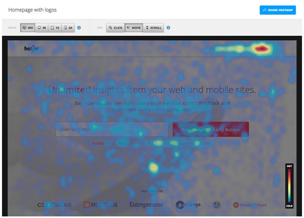 A heatmap by Hotjar, another great tool worth investigating
This map will help you position future advertising or image banners in areas most likely to catch your customer’s attention, whilst simplifying how you position important links across your website.
This is a solution that can be used to measure the performance of your entire website in addition to separate popular and highly-visited pages.
Most of today’s heat map or heat signature software provides a number of valuable metrics and add-ons.
For instance, you’ll be able to see your conversion rate on visits, your abandon rate across your entire website and individual pages, which fields and pages draw the highest amount of traffic, and a summary table of unique versus returning visitors.
Some software includes chat boxes that allow you to increase customer engagement by becoming an active participant in your customer’s visit. Should they have any questions, you can chat directly with them.
Click-Tracking Software
Most of today’s click-tracking software allows you to replay a given user’s visit to your website.
This allows you to view first hand how separate customers and customer segments interact with your site.
The playback feature allows you to easily interpret how visitors peruse your website by showing you a small coloured circle that mirrors how the user originally navigated separate pages.
This is similar to our aforementioned example of the heat mapping software. However, instead of tracking cursor movement on a mouse, this type of software tracks how mobile users scroll up and down using their thumbs.
Clicktale is one of the more popular click tracking tools online. This particular service focuses primarily on helping companies improve their user’s mobile experience.
An example of a Clicktail playback session
It’s similar to heat mapping software in that it defines high-traffic areas and provides a summary of how customers view, scroll and click on links when using a mobile phone, laptop, desktop or tablet.
Comment Sections and Common Sense
It’s always a good idea to empower your customers to provide feedback on what they like and don’t like about your website’s design.
Include a comments section or a poll and make a definitive statement about how your website is designed with your customers in mind. State that you welcome their feedback and take all suggestions seriously.
If your customers and visitors are having a hard time navigating your website, then you’re guaranteed to hear about it through the comments section.
Finally, be sure to adopt some common sense and website management best practises. Insist on having a weekly, monthly and or quarterly review of your website’s design, its metrics and its overall performance.
Be sure to track your week-to-week, month-to-month and quarter-to-quarter conversion rates. If, for any particular reason, your conversion rates start to decline, then be sure to sit down and ask why.
Conclusion
Long before you start worrying about whether your current design is mobile-optimised, or whether you’ve done all you can to reduce your bounce rates on mobile visits, it’s always good to start by making sure you know how your customers interact with your website.
Again, you can’t ask each and every customer what they think. However, you don’t need to when you use these aforementioned tips to make your website truly responsive.
Your Say!
Have you redesigned your site to be responsive yet? How did you go about it? Tell us the processes and data you analysed before you made any concrete decisions.
One thought on “Why Truly Responsive Design Must be Customer-Centric”
Comments are closed.