
Now that you’ve spent so much time and effort creating a great website for people to use, there’s nothing more frustrating than a high bounce rate. Sometimes it’s a sign that what you thought was right for your audience, actually isn’t!
Before we can identify why your bounce rate is high, it’s important to understand what bounce rate actually is.
What is Bounce Rate?
Let’s take out the definition straight from the horse’s mouth. Google Analytics defines a bounce as:
“Bounce rate is the percentage of visits in which users view only a single page of your site.”
Basically, it’s when a visitor reaches your page but then decides to leave.
They don’t click thorough to another page, leave a comment, signup for your email list or anything else for that matter.
Why do people ‘bounce’ from my website?
A ‘bounce’ could happen for any number of reasons:
- The user didn’t find the information they were looking for.
- They did find the information they were looking for, but couldn’t see any further value on the page.
- They saw something they didn’t like:
- Overly obtrusive ads.
- Poorly designed content.
- The desktop version of the site on a mobile device.
- Overly obtrusive ads.
I could probably list another 100 possibilities here, but most would be derivatives of the few key points above. That’s why I’ve come up with the following three points to cover in a little more detail:
- Poor Quality Page Design
- Lack of Call To Action (CTA)
- Poor Quality Content
Let’s start with a closer look at how page design affects bounce rate.
1. Poor Quality Page Design
I’m sure we’ve all got a favourite website, with a great design, that we love consuming content from. I know I’ve got a few of them! What I also know is that there are certain things on a page that will have me reaching for the back button in an instant.
Sure, every user is different, but avoiding the following design ‘faux pas’ you should help meet the needs of a wide array of users.
Adverts
We all understand that some websites need to advertise to generate an income. Fair enough. But when I can’t even see your content because there is half a page of ads before your page title … That’s over the line!
Keep your ads small and out of the way of your main content. The sidebar is a popular location as are contextual ads within the article itself.
Both of these placements will still allow everyone to read your content while giving you the opportunity to generate some cash.
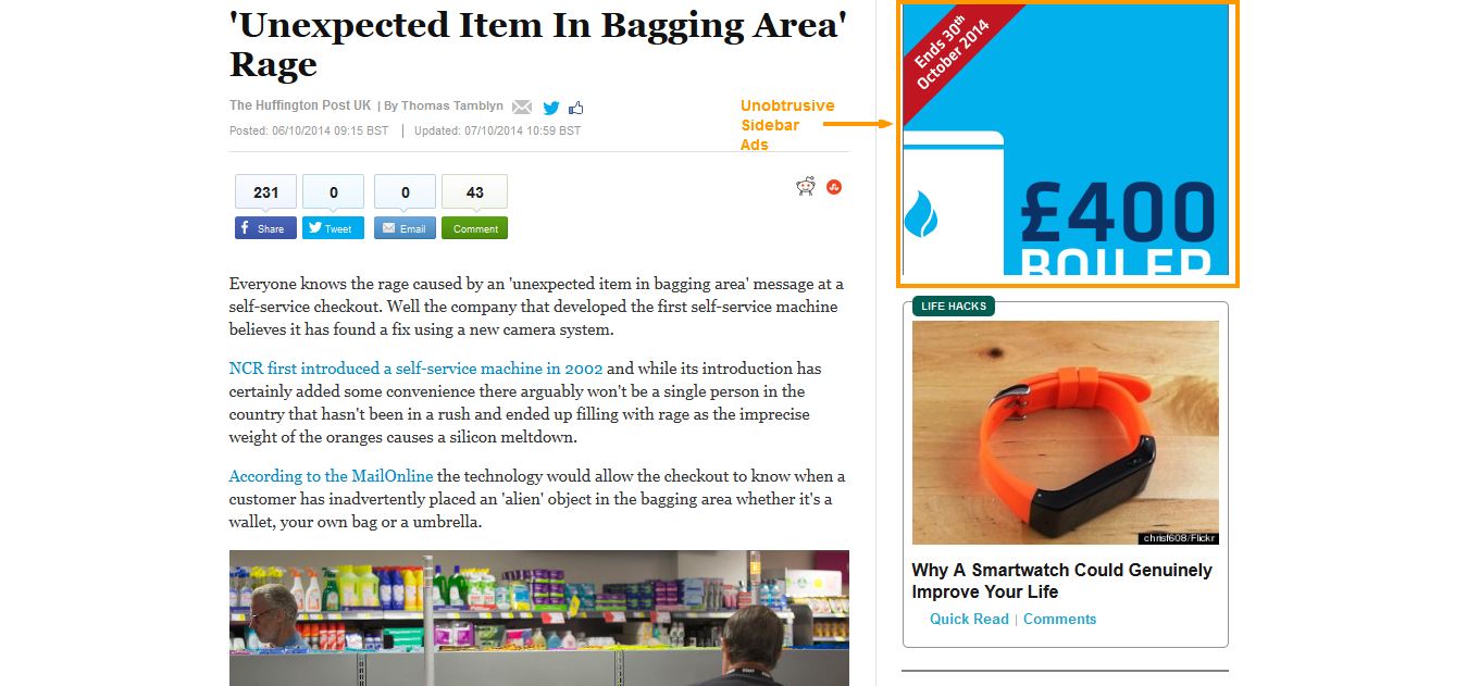
The Huffington Post is an example of a site that does this very well.
Site Speed
If your site is taking too long to load, users might get frustrated and end up pressing the back button. We don’t want that! A combination of good hosting and well optimised pages, is sure to keep your loading times snappy. Google have a free tool that will check your site speed and make recommendations on how to improve it.
Site speed is also a ranking factor for SEO, so it’s in everyone’s best interest to keep things fast!
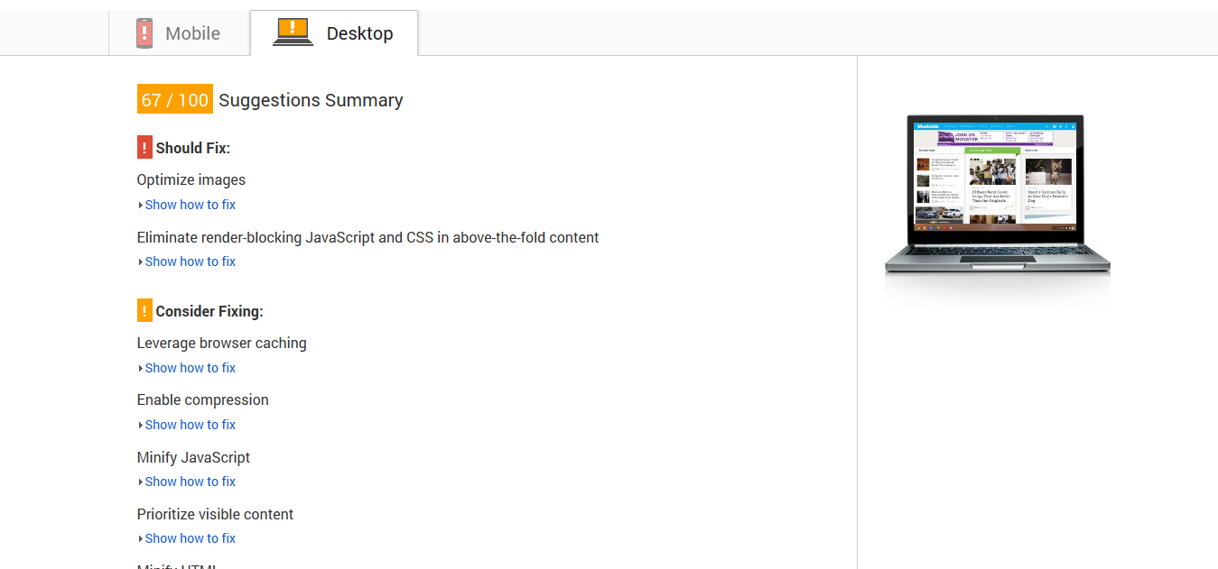 Google Page Speed
Page Titles and Meta Descriptions.
This is a little more complex. There needs to be a very close alignment between the title you’re using, which people click on in their search results and the content you’re giving them on the page.
One of the worst examples of this, which we’ve probably all fallen for, is being told something is ‘Free’ … Very rarely will you click on a title that has the word ‘Free’ in it and you’ll actually get something for free.
Make sure when you’re generating the title for your post that it explains exactly what you’re offering on the page. Don’t try and deceive people into getting onto the page, only to be disappointed by what they find. It’s a sure fire way to send your bounce rate through the roof!
2. Lack of Call to Action
Let’s start with the basics again. What is a call to action? Here’s the Wikipedia definition:
“In marketing, a call to action (CTA) is an instruction to the audience to provoke an immediate response, usually using an imperative verb such as “call now”, “find out more” or “visit a store today”.”
Basically, you are directly telling your readers what you want them to do.
In the definition, they use visiting a store or calling now as your call to action. The call to action you use will depend on the end goal of your page.
Often, the call to action might be a social share or email signup. Not everyone is always telling people to “buy now”. In the digital age, people want everything done yesterday. By guiding them through what they need to do, by literally telling them, you’re giving them an incentive to carry on.
Obviously the pre-requisite here is that you know what you want people to do when they land on your page. If you don’t know that … the page might not be absolutely necessary.
There are lots of resources out there that discuss calls to action and what you should be asking your users to do. Crazyegg is a fantastic blog for this kind of inspiration and you’ll be hard-pressed to find a better call to action! People often use the Evernote site as a great example of an effective CTA:
 Evernote landing page with clear CTA
Think about the action you want people to take when they reach each page of your website. Is it Tweet your link? Sign up for an email list? Buy a product? Share a photo on Facebook? Read the next post in the series?
Whatever it is, tell them!
This will reduce your bounce rate by increasing the number of people who take action on your website, rather than consuming your content then running off to the next website.
3. Poor Quality Content
Hopefully, as webmasters, we all take pride in our websites. If you don’t, I’m not sure why you even have one!
Anyway, the quality of the content on your website is absolutely crucial. Whatever form your content takes, you need to make sure that the user is getting what they need.
In recent years, the quality, design and substance of content being posted online have increased dramatically. The problem for lots of older websites is that they haven’t been able to keep up the pace.
That leads to people expecting more. Internet users, as I said earlier, expect everything yesterday. They haven’t got time for content that doesn’t give them what they need.
Poor quality content can come in many forms. Something that really grinds my gears is overly long paragraphs. Being met with a wall of text is a real turn off for web users, so break up your content into smaller paragraphs and use bullet points to make key statements.
Don’t forget to include headings and subheadings to ensure that you’re breaking down your content into easy to consume chunks. This will give the user a chance to find the exact information they need even more quickly.
Also, think about the graphics you use in your posts.
Graphs, images, tables and videos really help keep the user engaged. Imagine landing on a website now that was literally just plain text. The chances of you continuing to use the site, or even start using it, would be pretty low.
They don’t have to be difficult to create either! I knocked the below graphic up in about 10 minutes using creately.com:
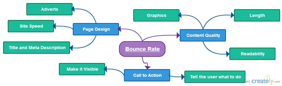 Chart created with creately.com
It’s a really simple graphic but it’ll help my post stand out from my competitors.
Plus it just diversifies the way a user can consume my content. If they’re not big into reading lots of text and prefer to have a graphic representation – I’ve provided it!
Wrap Up
So there you have it, a little introduction into the world of bounce rates. It’s just the tip of the user experience iceberg though.
Notice I say user experience … Bounce rate isn’t a direct SEO ranking factor, but it does give you a really good indication of how your site is performing and whether or not users are engaging with your content.
Reducing your bounce rates will help you keep users on your site for longer. All the while increasing the chances of that user converting into a reader, subscriber, customer or member (depending on what the end goal of your site is).
Remember, site speed can play a big role in your bounce rate figures, so make sure you have a reliable and speedy web host like the guys at LCN.com. Check out their hosting and pick the right plan for your website. If you have any questions, just get in touch with their UK support team.
Your Say!
I hope you’ve enjoyed this post and learned a thing or two! If you have got any questions to feel free to leave them in the comments and I’ll respond to them as soon as I can.
A very good article/blog – learnt a thing or two.
Many thanks >tee bee
Thanks Tee Bee! – Glad you enjoyed the post.