
Your business can have the best domain name and have huge potential, but if your website is second-rate, potential customers are unlikely to be engaged and won’t stay on your site for long.
Ultimately, if your website looks unprofessional, it makes your company look unprofessional, which can seriously damage your reputation and business plans.
[Tweet “7 simple ways to make your business website look more professional…”]So how do you make sure you project the right image?
While there are no fixed rules, there are some simple ways to create a good impression and keep visitors on your site for longer. Here are seven simple web design strategies to ensure your business is seen in the best possible light.
Select the Right Font and Background
A font can set the tone for your whole website. Cheap-looking fonts will give the impression that your products and services are also cheap, and hard-to-read fonts will send your bounce rates through the roof.

Sans serif fonts (without the curly bits) are easier to read on a computer screen, and black or dark grey fonts on a white or off-white background are easy on the eye.
Also take inspiration from big-brand sites that use a lot of white space around text to create a sense of luxury and clarity.
Upload a Favicon
Favicons are the little icons that show up by your website name in the browser tab and to the left of the website name for a bookmarked website.
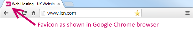
As well as strengthening your brand’s image, they help your website stand out when someone bookmarks your site.
It’s fairly straightforward too – check out our simple guide to adding a favicon to your website.
Use Larger Images
Apart from text, it’s images that can turn an ordinary-looking page into something more special and memorable.
The growing trend of larger images on business websites tells a story; consumers today are more engaged when they see clear imagery that is aligned to a brand’s overall message. The Apple site is an excellent example of this.
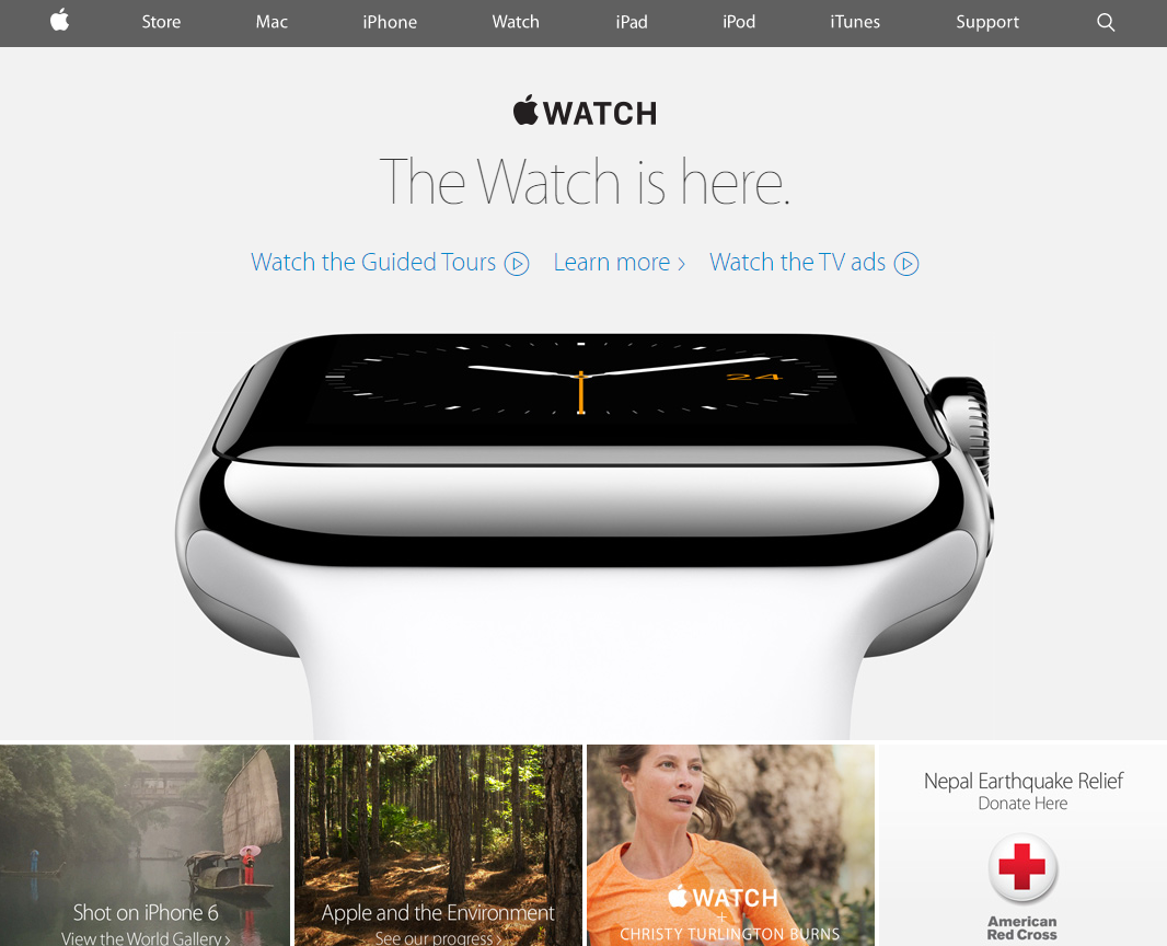
If your budget allows, instead of using stock images, team up with a professional photographer.
It’s a worthwhile investment when you consider how this could impact your credibility in the eyes of potential clients.
Keep It Simple
Having a professional-looking website doesn’t mean you need to add flashy elements to the site. In fact, as with many high-end designs, less is more.
Just take a look at any luxury retail store; compared to a budget store, there is usually less on display and plenty of space to draw attention to the valuable products on offer.
The same principle can be applied to websites.
Keep it organised and clutter-free to convey a sense of professionalism. It will also help to direct the visitor’s attention to the things that really matter on each page.
Choose Your Colour Scheme Carefully
Much like fonts and backgrounds, colour schemes can have a huge impact on brand image and the immediate appeal of your website.
Many quality brands avoid vibrant colours and high-contrast colour combinations. Subtler shades tend to look more professional and less “cheap”.
If you want to browse through various colour schemes or create your own, free online tools such as Adobe Kuler are perfect for professional and amateur designers.
Don’t Forget Small Screens
Catering to the mobile consumer is more important than ever before, especially since mobile friendliness is now a ranking factor for Google.
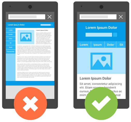
With many more people accessing the Internet via smartphones, mobile responsive designs are crucial in the battle for consumer attention.
If your site doesn’t look good on small screens, you’ll simply look old-fashioned and unprofessional.
Work With the Right Design Agency
Unless you’re a professional, making design changes to a website can be tricky. One small mistake in the coding can wreck a whole page. Thankfully there are many tools out there, such as WordPress, that make site creation a possibility for an amateur.
However, if you really want to engage your audience, it may be worth investing professionally designed site that people will want to stay on for longer and return to in the future.
When choosing an agency, make sure they listen to your business goals and check out their portfolio for previous work.
While it may cost more initially, a professional design could benefit your business in the long run and you can have a website that you can be proud of.
Conclusion
In summary, choose your fonts and colour scheme carefully, use larger images, optimise for mobile devices, work with a design agency that understands your business, and remember that simple designs are often the best.
Sometimes, it’s the small changes you make to your website that have the biggest impact on your image and reputation.
Make your website look more professional and you can attract the right audience, build a loyal following, and ultimately increase sales.
Designing a website? Give it the best possible home with LCN website hosting.
Your Say!
What do you think makes a website or page look unprofessional? Is there anything on a sales page that would instantly make you abandoned the page and not complete an order? Let us know!
2 thoughts on “7 Tips to Make Your Website Look More Professional”
Comments are closed.