
If you’ve been anywhere near the search engine optimisation world in the last six to twelve months then you’ll know that everything is changing; but if your everyday grind means that you are not required to delve into the inner depths of Google’s workings then this knowledge may have simply passed you by.
[Tweet “Why is responsive web design more important than ever?”]In short, one major thing has changed: The Mobile friendliness update
Content
Content matters, and understandably so.
In the past people would be writing utter nonsense just to cram in a few keywords and get a link to help boost their DA, great for them but rubbish for normal internet users.
Now, content has to be clever. It has to be engaging. It has to have a point. It has to resonate with the audience. If you don’t do this then you won’t go very far with Google – again it makes sense.
But then, along came the latest update. The one that’s being fearfully referred to as Mobilegeddon.
Mobilegeddon
Bombshell.
This update didn’t care how well you were writing content, how engaging your articles are, how many people share them across social media or how many links are directed to it. (OK, that’s a lie it still takes these into account, but I’m making a point here.)
If your website wasn’t mobile friendly then it would lose out in favour of ones that are.
Yep, that’s right – yet another ranking factor that Google is using in its never ending quest to give users what they want.
The introduction of Mobilegeddon has forced many webmasters to update their websites in order to make them mobile friendly. This isn’t something that’s new, however, as Google has been blending mobile ranking factors in now since 2009!
Related: Why responsive design must be customer-centric
Significant Changes
Despite the apocalyptic nickname, the initial changes brought on by this update were rather tame. Sure, some websites benefited over their competitors and rankings fell and rose accordingly but nobody saw their website absolutely bomb as a result of this update.
The reason: Mobilegeddon is just getting started.
While this hasn’t been officially announced, there is plenty of evidence suggesting that this update will continue to make changes and over time these changes could be the reason your web traffic hits rock bottom.
That means that if you haven’t already made the jump to being mobile-friendly then you really, really need to.
Nearly half of all web traffic is now mobile, and it is these devices that are being affected the most by this update.
So let’s say, for example, that you typically have 10,000 visitors to your website every month – to lose half of these would drop the number down to 5,000. That’s half your profits, every month, disappearing as a result of not upgrading your website.
Fighting Mobilegeddon
You’ll be delighted to learn that you don’t have to get on a spaceship and drill a hole halfway through an asteroid and blow it up in order to avoid Mobilegeddon. In fact, the answer to your problem is staring you straight in the face – responsive websites!
As the future becomes the present you need to adapt or you’ll be left behind. The issue here is that lots of people are seeing the ‘mobile’ part of Mobilegeddon and thinking they need a separate website for their mobile traffic. Wrong.
While there are many benefits to having a mobile specific site, you’ll find that a responsive site carries all these benefits and more!
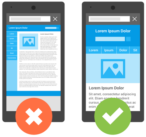
The clearest example is screen size – just look at phones in the last year, it used to be 4” was the norm but now you have 6”, 7” and even 8” phones becoming common place. Great for technology, rubbish for your mobile website optimised for a 4” screen.
A responsive website takes away this problem and adjusts your site to suit whatever sized screen it is accessed by, whether that’s a 90” projector, a 36” monitor a 16” tablet or even a 4” phone – it simply does not matter thanks to something called graceful degradation.
What’s more, this is the type of thing Google loves. You’re making your website readily available for anyone wishing to see it. That’s great for the user and therefore great for rankings, meaning that you will have well and truly future proofed your website against mobile updates.
Start Fixing the Problem Today
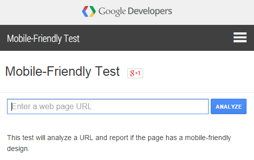
If you’ve noticed an issue with traffic dropping to your website then it could well be the result of the mobile responsive update, you can check whether your website is mobile responsive by using Google’s Mobile Friendly Test.
Don’t wait until it’s too late, start taking steps to rectify this issue before you see yourself be affected by it.
Your Say!
Is your site mobile optimised? Not sure about the differences between dedicated mobile sites and responsive design? Drop us your comments and questions below.
Rhys really useful info thank you:)