
In the UK, over 2 million people are living with sight loss and 3 million with colour blindness. On top of that, 360,000 are registered as blind or partially sighted.
Making your website accessible to the visually impaired not only helps these users but also your business. Five million UK buyers is a significant market to lose out on – especially when many accessibility issues are simple to fix.
Even Google is now placing more importance on website accessibility. Just this month, they released a new page experience update, that takes into account (you guessed it) a user’s experience on a page. And if disabled users regularly have a poor experience, Google might choose to rank a better performing competitor instead.
At LCN, we are believers in the power of designing a website with accessibility in mind. And we’re always looking to improve our own designs to provide an effortless experience for all of our users.
With this in mind, we wanted to conduct a mini accessibility audit of the top 50 retail homepages in the UK. We then wanted to highlight a few ways these websites could perform better for visually impaired users.
For this, we turned to two of the main tools that are regularly used by accessibility evaluators: Google Lighthouse and Wave by WebAim.
The first of which gives webmasters a performance score from 0-100. The latter showcases how sites can improve.
The Most (and Least) Accessible Retail Sites Overall
| Retail Site | Google Lighthouse Accessibility Score |
|---|---|
| H&M | 100 |
| Laura Ashley | 99 |
| Beauty Bay | 98 |
| B&Q | 98 |
| Sainsbury’s | 98 |
| Ann Summers | 96 |
| Wickes | 96 |
| Karen Millen | 91 |
| Oasis | 91 |
| Tesco | 91 |
| John Lewis | 91 |
| Amazon | 90 |
| Apple | 90 |
| Evans Cycles | 90 |
| Space NK | 89 |
| Asos | 88 |
| American Golf | 87 |
| Holland & Barrett | 86 |
| Dunelm | 86 |
| Morrisons | 84 |
| Waitrose | 84 |
| House of Fraser | 81 |
| Very | 81 |
| Argos | 81 |
| Schuh | 80 |
| Superdrug | 80 |
| Axminster | 79 |
| River Island | 79 |
| Dune London | 78 |
| Moss Bros. | 77 |
| Ao.com | 77 |
| Boots | 77 |
| JD Williams | 75 |
| Next | 75 |
| JD Sports | 75 |
| Debenhams | 75 |
| Asda | 75 |
| Screwfix | 74 |
| Nisbets | 74 |
| Simply Be | 72 |
| Jacamo | 72 |
| Marks & Spencer | 72 |
| Office | 71 |
| The Perfume Shop | 71 |
| Currys | 69 |
| Chain Reaction Cycles | 67 |
| Wilko | 63 |
| New Look | 63 |
| Carphone Warehouse | 58 |
| Halfords | 47 |
Homepages that offer an accessible experience should strive for at least 90-100 on Google Lighthouse. Any sites that hit this have their score highlighted in green.
H&M boasts a perfect score for their UK homepage. Other notable entries include Laura Ashley, Beauty Bay, B&Q and Sainsbury’s.
On the other hand, if Google believes a homepage needs improvement, scores usually sit between 50 to 89. This doesn’t necessarily mean these pages offer poor accessibility, though.
Sites that could do with some improvement include Superdrug, Boots and Carphone Warehouse.
A score below 50 represents poor accessibility. Just one site currently has a score below 50 on its homepage: Halfords.
Wave by WebAim helps us understand which visual disabilities in particular sites may need to pay extra attention to.
The Most (and Least) Accessible Sites for Colour Blind Users
Colour blindness is one of the most common visual impairments. It’s also one that’s commonly overlooked, as it can be poorly understood by those with regular vision.
According to the current Web Content Accessibility Guidelines (WCAG), to pass level AA, sites should strive for a contrast ratio of 4:5:1 for normal text and 3:1 for large text. To pass level AAA there needs to be a 7:1 contrast ratio for normal text and 4:5:1 for large text.
Large text is defined as 14 point (typically 18.66px) and bold or larger.
For graphics, it is suggested to strive for a 3:1 contrast ratio.
Wave by WebAim identifies any situations on a homepage that fail to meet these contrast ratios.
Six of the sites studied currently have no issues. But as seen below, Superdrug has the most colour contrast issues that may affect colour blind users:
| Retail Site | Colour Contrast Errors |
|---|---|
| Superdrug | 251 |
| Wilko | 86 |
| Simply Be | 47 |
| Nisbets | 40 |
| The Perfume Shop | 40 |
| Retail Site | Colour Contrast Errors |
|---|---|
| Laura Ashley | 0 |
| Oasis | 0 |
| Next | 0 |
| Space NK | 0 |
| American Golf | 0 |
| Dunelm | 0 |
*NOTE: 6 sites are listed as they are all tied for the top position
We’ve used an interactive slider to showcase what the current Superdrug homepage looks like, compared with what it should look like to pass the WCAG level AAA guidelines.
Below you can see just miniscule colour changes to Superdrug’s homepage allow accessibility for the colour blind:
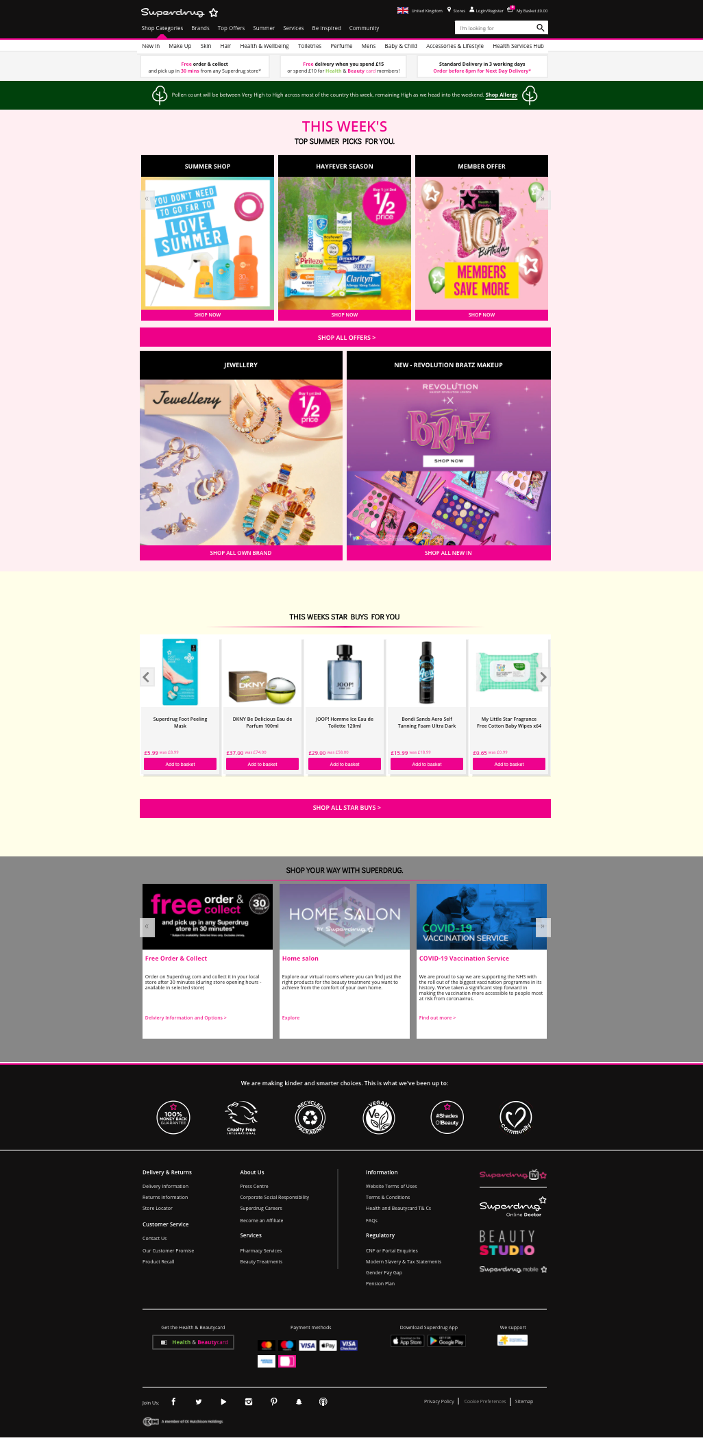
Considering colour contrast errors are often caused by a small margin, this means sites can usually fix it without a complete overhaul to their site.
The Most (and Least) Accessible Sites for Screen Reader Users
Screen readers allow those with sight loss to access an audio version of a web page rather than view it. This way they can still navigate, access content and buy products with confidence.
To make sure screen readers run efficiently, websites should be accurately coded, with no missing, empty or duplicate elements.
Secondly, you can implement Accessible Rich Internet Application (ARIA) elements in your HTML. These will help with any assistive screen reader technologies such as Apple VoiceOver, JAWS or TalkBack.
Below you can see which sites could improve their experience for screen reader users:
| Retail Site | Screen Reader Errors |
|---|---|
| Boots | 178 |
| JD Williams | 78 |
| New Look | 66 |
| Currys | 57 |
| Very | 56 |
| Retail Site | Screen Reader Errors |
|---|---|
| B&Q | 0 |
| Sainsbury’s | 0 |
| Beauty Bay | 1 |
| Dunelm | 1 |
| Ann Summers | 2 |
| H&M | 2 |
*NOTE: 6 sites are listed as B&Q and Sainsbury’s are tied
Boots in particular has room for improvement. Largely this comes down to the fact its website has incorrectly implemented some ARIA elements in the menu. This means when screen reader users try to navigate the menu, they aren’t getting the full experience that visually able users get.
The Most (and Least) Accessible Sites for Partially Sighted Users
Partially sighted users may be able to access most of your site with ease. But issues start to arise when you include small text scenarios.
A small text scenario is defined as any text sized at 10 pixels or smaller.
The majority of sites performed very well here. 36% of all homepages analysed had zero small text scenarios, this includes:
- Currys
- Halfords
- JD Sports
- The Perfume Shop
- Chain Reaction Cycles
- Superdrug
- Asos
- Debenhams
- Argos
- Asda
- Tesco
- Holland & Barrett
- John Lewis
- Waitrose
- America Golf
- Beauty Bay
- Dunelm
- B&Q
- Sainsbury’s
The following sites had small text scenarios on their homepages that may be difficult for partially sighted users to read:
The Top 5 Least Accessible Sites for Partially Sighted Users
| Retail Site | Small Text Scenarios |
|---|---|
| Carphone Warehouse | 32 |
| Wilko | 31 |
| Amazon | 18 |
| Screwfix | 14 |
| Axminster | 14 |
Carphone Warehouse posted the most amount of small text issues at the time of analysis (32). We’ve taken some screenshots of their menu before improvements. Here, they’ve included a ‘New’ label, next to some menu options. This text is likely too small for partially sighted users to read.
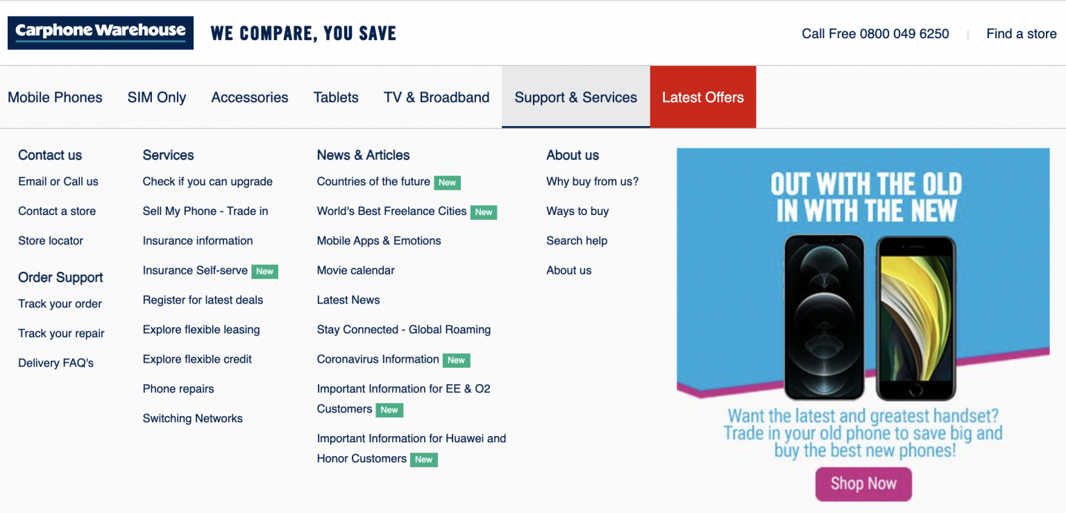
By increasing the size of the ‘New’ label to above 10 pixels, Carphone Warehouse would have a fully accessible menu for partially sighted users.
Conclusion & Key Findings
There are always elements to improve on when it comes to website accessibility. We recommend taking the time to look at your homepage to make sure it is fully accessible for those with visual impairments.
Google Lighthouse offers an initial performance score – which acts as a useful benchmark for ongoing website reviews – while Wave by WebAim identifies exactly where you might be going wrong.
The homepage is and always will be your most important page – it’s the first page most users will land on. So, you need to prioritise making the changes here. Once you have the resources, other areas of your site can be analysed too.
To summarize, these are the key findings:
- H&M is the most accessible retail site for visually impaired users.
- Halfords is the least accessible retail site for visually impaired users.
- All of Laura Ashley, Oasis, Space NK, American Golf, Dunelm and Next offer accessible options for colour blind users.
- Superdrug has the most homepage issues for colour blind users.
- B&Q and Sainsbury’s have the least issues for those using a screen reader.
- Boots has the most homepage issues for those using a screen reader.
- 38% of the top retail homepages have no issues for those with slight vision loss.
- Carphone Warehouse has the most homepage issues for those with slight vision loss
Most homepages need just minor changes to improve their Google Lighthouse score. After this, more people can fully access your site, increasing your chances of driving conversions for your products and services.
For more information on how you can make your website more accessible, please refer to the Web Content Accessibility Guidelines (WCAG).
Methodology
We opted to analyse homepages only, as this is and always should be the most important page on any website. However, from the outset, we knew that accessibility should expand beyond just the homepage. So, our rankings may not represent the full picture.
Google Lighthouse and Wave by WebAim were used to audit all sites.
The Google Lighthouse score from 0-100 was used to rank sites overall for accessibility on mobile only.
To rank sites by their accessibility for colour blind users, colour contrast errors were identified using Wave by WebAim. While their Colour Contrast Checker was used to identify what Superdrug could do to pass the WGAG.
To rank sites by their accessibility for screen reader users, all errors around missing, empty or duplicate elements were totalled up, alongside any broken ARIA elements.
To rank sites by their accessibility for the partially sighted, all small text alerts were counted.